The Grammy-winning designer on the case for beauty, what AI does to taste and how to tell if a show changed anyone's mind
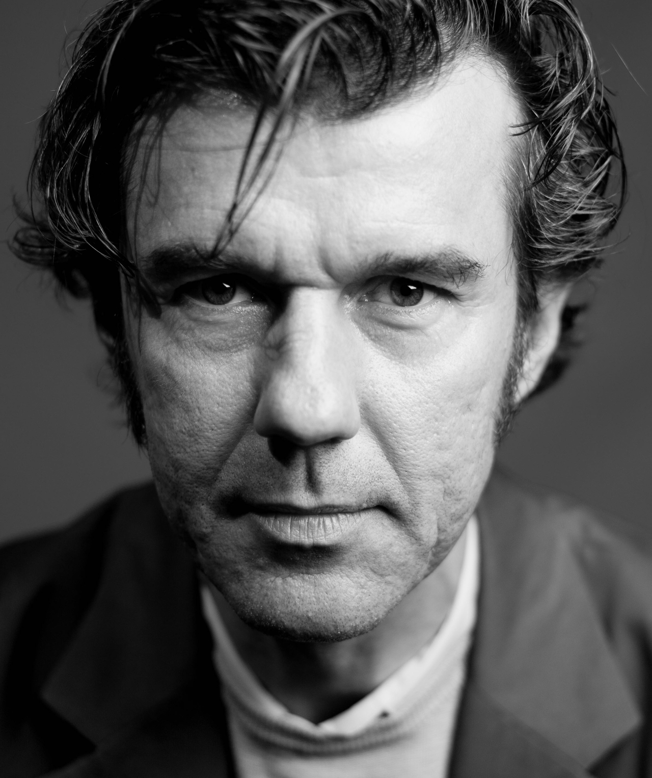
Stefan Sagmeister has been telling designers that solving a problem is nothing to brag about.
Any competent professional, he argues, should be able to produce a readable poster or design a comfortable chair in an afternoon. Making something beautiful is where the actual work starts, and the profession has been hung up on the practical side of things for too long.
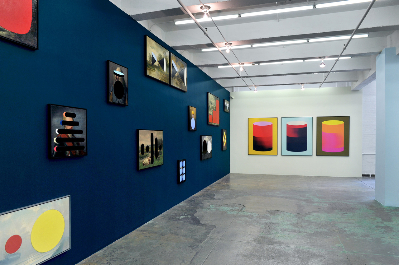
The Austrian-born, New York-based graphic designer was behind the album covers for Lou Reed, the Rolling Stones and Talking Heads. His recent output, part data visualization and part folk art, renders long-term data on human progress onto old oil paintings, sculptures, even everyday objects like sneakers and drinking glasses.
This year's Herald Design Lounge, formerly the Herald Design Forum, runs under the theme "Beyond Visuals" at Dongdaemun Design Plaza on Oct. 2. Sagmeister opens the event with a keynote titled "Finally, Something Good," which also happens to be the name of his exhibition opening in Paris next month. He answered questions from The Korea Herald by email ahead of his visit.
Q. This year's theme is "Beyond Visuals," which speaks to the idea that design shapes emotion and experience, not just images. Is the field coming around to that view, or does "function first" still rule?
The public came around long ago; they always preferred the beautiful (train) station to the efficient one. The profession is slower, partly because we spent 50 years defining seriousness as the absence of beauty. At the center of my argument is the fact that functionality is easy to achieve. Many designers who call themselves problem solvers are actually just lazy, as most of our problems are easy to solve. Solving them beautifully would be really hard.
Q. You've called so much of today's design templated. Does AI deepen that sameness, or could it break it?
By default it deepens it, because a model trained on everything returns the average of everything. It can also break it, but only for somebody who arrives with a strong opinion, so the gap between designers who have one and designers who do not is about to become very visible.
Q. Your keynote borrows its title from your exhibition on long-term progress. What makes optimism a subject worth a designer's attention?
It is not really optimism, it is more like accuracy. The picture many people carry around of the world is factually wrong, and correcting a wrong picture is a rather straightforward design problem.
Q. Your recent paintings set data visualizations into 19th-century canvases. What does that do that an infographic can't?
The earliest of these canvases were unsold stock from my great-great-grandparents' antique store that ended up in the attic of the house I grew up in. Their mediocrity is what gave me permission to cut giant holes into them and insert graphics representing data. An infographic asks to be believed and then forgotten, while a painting somebody kept for 150 years gets hung in a living room, where the number has to be looked at again and again for years.
Q. This event puts you alongside Korean artists and designers working across media, typography and AI. How does Korea register in the global design conversation right now?
Any answer I give is a visitor's impression, so take it as that. What I notice is that Korea stopped waiting for approval from New York or London. In typography, particularly, there is an advantage, since Hangul is a designed system rather than an inherited accident, and designers who grow up inside a designed system treat form as something decided rather than given.
Q. Can a work of design actually change someone's mind about the state of the world, and how would you know if it did?
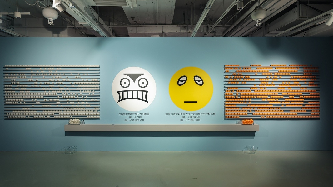
In (the) Paris (exhibition), the visitor picks between two doors, one marked optimist and one marked pessimist, and there is a second pair at the end of the show, so the two counts can be compared. It is a crude instrument, but it is an actual number, and I would rather have a crude number than the usual claim that the work was meaningful.
moonkihoon@heraldcorp.com