

Most Popular


-
6
[KH Explains] How should Korea adjust its trade defenses against Chinese EVs?
![[KH Explains] How should Korea adjust its trade defenses against Chinese EVs?](//res.heraldm.com/phpwas/restmb_idxmake.php?idx=644&simg=/content/image/2024/04/15/20240415050562_0.jpg&u=20240415144419)
-
7
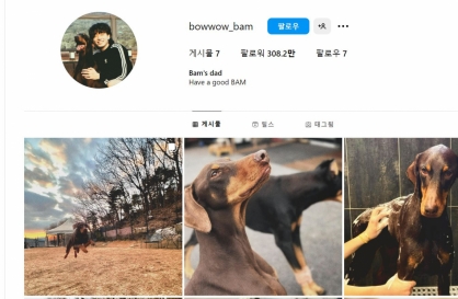
BTS' Jungkook creates Instagram account for his dog
-
8
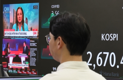
Korea braces for blows from Middle East conflict
-
9
Seoul says will cut power to porn festival planned on Han River
-
10
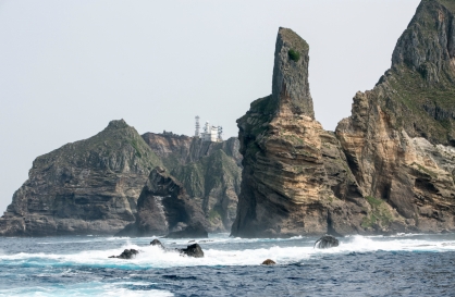
S. Korea ‘strongly’ protests Japan’s claim over Dokdo in diplomatic bluebook
![[KH Explains] How should Korea adjust its trade defenses against Chinese EVs?](http://res.heraldm.com/phpwas/restmb_idxmake.php?idx=644&simg=/content/image/2024/04/15/20240415050562_0.jpg&u=20240415144419)


[Editorial] Not just another logo
City branding requires more than public participation
By KH디지털2Published : Nov. 1, 2015 - 17:56
“I.Seoul.U” was proclaimed as the new city brand for the Korean capital last Wednesday evening at Seoul Plaza, amid much fanfare.
Those who saw the logo for the first time were puzzled at the string of English letters and a Korean character. Only when the Korean explanation below the logo is read, roughly translated as “Seoul, mine and yours” or “My and your Seoul,” is it possible to get a sense of what the logo is attempting to communicate. Still, the logo is puzzling.
The public reaction to the new Seoul logo so far has been far from positive. The reasons are various -- some claim it is Konglish, some wonder why the letter “O” is rendered in a variation of the Korean alphabet that looks similar to the letter “O” and some complain that they just don’t understand the message.
Such adverse reactions to the new city logo should not come as surprise to city officials. When the final three candidates up for vote -- I.Seoul.U, Seoulmate, and Seouling -- were unveiled earlier this month, the general response was that none of the three were satisfactory.
The reaction was so negative that the city felt compelled to post a statement online. The official statement, whose overall tone was defensive, said that Seoulites actively participated in the branding process, giving their input about what characterizes Seoul, after which three keywords were identified. This was followed by an open contest for a new brand using the three concepts -- coexistence, passion and relaxed -- and the more than 16,000 submissions received went through several rounds of screening in which both citizens and experts took part.
The Seoul Metropolitan Government is defending its new city brand by saying it was the people’s choice. Pointing out that all new brands face initial skepticism, the city said the public would get used to it.
The city should be lauded for getting people’s participation in the branding process. However, the laypersons’ participation should have been limited up to a certain point. Once the keywords had been identified, the project should have been handed over to the experts. For the mayor to ascribe the value of the new city brand solely to citizen participation is irresponsible.
As much as the city brand represents Seoul, it is something that must be communicated to non-Koreans. When foreigners look at a brand logo of Seoul, they should be able to instinctively understand what it is trying to convey. Clearly, this is not the case with I.Seoul.U, and well aware of the problem, the city said that it would use taglines in English, Chinese and Japanese when using it for tourism purposes.
The former Seoul brand, Hi Seoul, launched in 2002 also had its many opponents, but the brand was kept for the past 13 years and its value was estimated at 30 billion won ($26.3 million) as of last year. Similarly, with time, people may get used to the new brand logo. But when the new brand does not seem to be much of an improvement over the old, people are bound to wonder, why change it? A logo has value when people covet it. This doesn’t seem to be the case with the new logo. Seoulites deserve a logo they would be proud to show off.

![[Today’s K-pop] Stray Kids to return soon: report](http://res.heraldm.com/phpwas/restmb_idxmake.php?idx=642&simg=/content/image/2024/04/16/20240416050713_0.jpg&u=)