Most Popular


-
6
US confirms $6.4 billion chip subsidy for Samsung
-
7
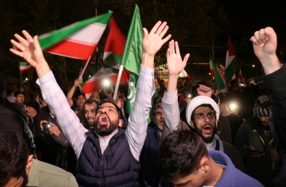
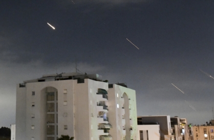
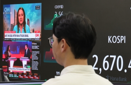
Israel says Iran launched more than 300 drones and missiles, 99% of which were intercepted
-
8
[KH Explains] How should Korea adjust its trade defenses against Chinese EVs?
![[KH Explains] How should Korea adjust its trade defenses against Chinese EVs?](//res.heraldm.com/phpwas/restmb_idxmake.php?idx=644&simg=/content/image/2024/04/15/20240415050562_0.jpg&u=20240415144419)
-
9
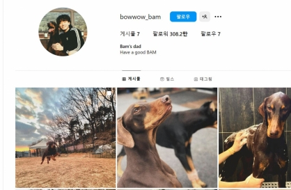
BTS' Jungkook creates Instagram account for his dog
-
10
Korea braces for blows from Middle East conflict


![[KH Explains] How should Korea adjust its trade defenses against Chinese EVs?](http://res.heraldm.com/phpwas/restmb_idxmake.php?idx=644&simg=/content/image/2024/04/15/20240415050562_0.jpg&u=20240415144419)


Logos send impactful messages, and many companies are tweaking their logos to encourage social distancing and convey messages of hope.
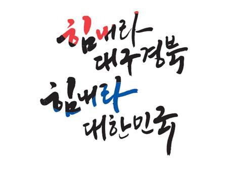
The Ministry of Culture, Sports and Tourism on Tuesday posted on the internet a cheer-up logo that can be used for free. The red, blue and black logo reads “Cheer up, Daegu, North Gyeongsang Province. Cheer up, Korea.”
“We hope that this ‘Cheer up, Korea’ logo gives whatever small help it can give to the people suffering from COVID-19,” said a ministry official. Last week, government officials, including the prime minister, wore masks with the “Cheer up, Korea” logo to promote the use of cotton masks.
While the ministry’s logo is intended to console the people, other corporate logos have been altered to promote social distancing.
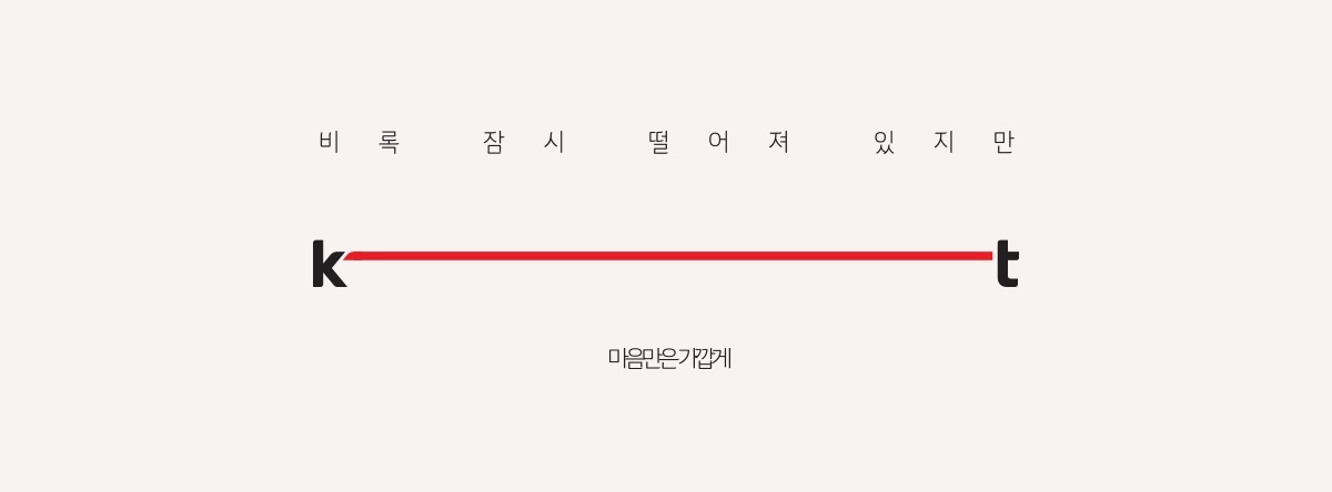
KT posted on its social media page a version of its logo with the letters ‘k’ and ‘t’ at either end of a red line.
“Although we are temporarily apart, our hearts remain close,” the KT message reads.
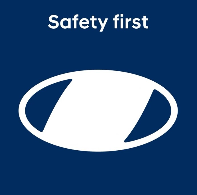
Hyundai also posted on Instagram a video of its logo morphing into a mask and a picture of its logo changing from a handshake into an elbow bump.
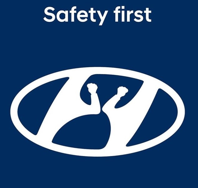
“Did you know that our logo represents two people shaking hands? We reimagined it since #socialdistancing is important for all of our safety,” the Hyundai Instgram post reads.
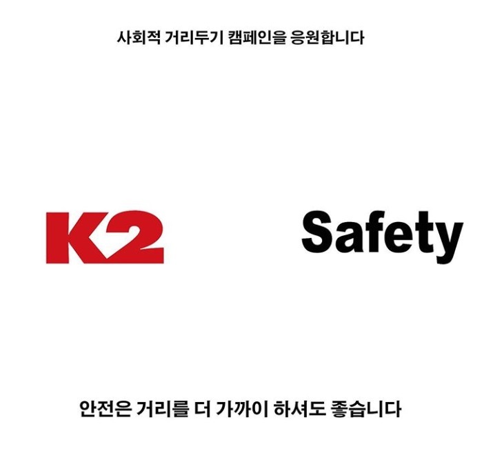
K2 Safety, the safety equipment branch of the outdoor clothing brand K2, posted its logo with the words “K2” and “Safety” spaced far apart on its social media page.
“We support social distancing. It’s all right to keep safety closer,” reads the K2 message.
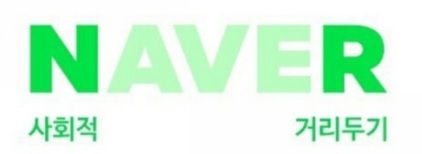
Portal sites such as Naver, Daum and Nate have joined in, promoting social distancing with their logos. Naver blurred out the letters “ave” in its name to suggest the first and last letters were keeping a safe distance.
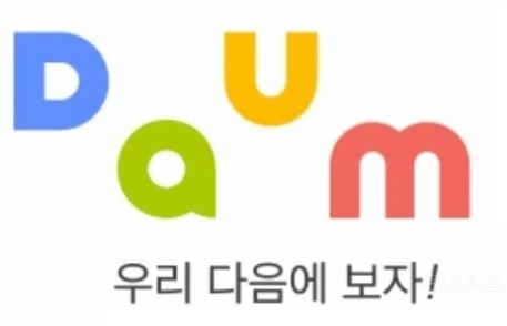
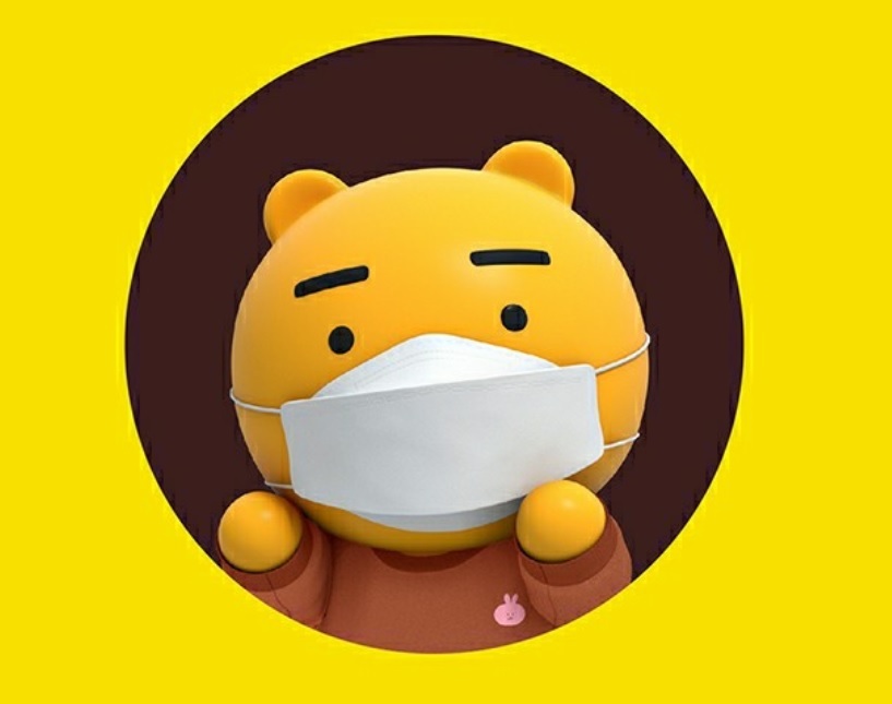
Kakao put a face mask on its character Ryan, who appears on the KakaoTalk loading screen, from March 26 to April 5. It also altered the logo of portal site Daum so that the letters are spaced far apart in the phrase, “Let’s see each other next (Daum) time!” Daum means next in Korean.
Nate also added space between its letters and included the slogan “Let us be apart for now.”
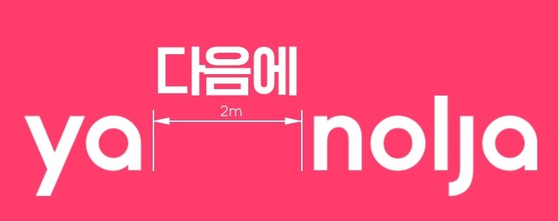
The reservation platform Yanolja also altered its logo, separating the syllable “Ya” -- which means “hey” -- from “nolja” -- which means “let’s play” -- with a 2-meter symbol and the words “next time.”
Numerous global corporations, such as McDonald’s, Volkswagen, Audi, Mercedes Benz and Coca-Cola, have transformed their logos to promote social distancing. McDonald’s separated its famous golden arches in two, and Coca-Cola put up a logo on its Times Square advertisement screen with the letters spaced far apart along with the phrase “Staying apart is the best way to stay united.”
Meanwhile, Slovenia-based designer Jure Tovrljan gained world fame by posting COVID-19 changes to the logos of Starbucks, Nike, NBA, Mastercard, Olympics and Corona Extra, among others.
By Lim Jang-won (ljw@heraldcorp.com)
-
Articles by Lim Jang-won