

Most Popular


-
6
[KH Explains] How should Korea adjust its trade defenses against Chinese EVs?
![[KH Explains] How should Korea adjust its trade defenses against Chinese EVs?](//res.heraldm.com/phpwas/restmb_idxmake.php?idx=644&simg=/content/image/2024/04/15/20240415050562_0.jpg&u=20240415144419)
-
7
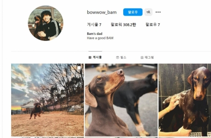
BTS' Jungkook creates Instagram account for his dog
-
8
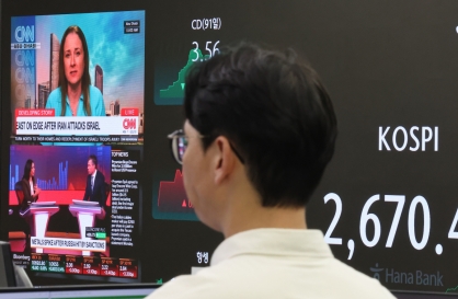
Korea braces for blows from Middle East conflict
-
9
Seoul says will cut power to porn festival planned on Han River

-
10
S. Korea ‘strongly’ protests Japan’s claim over Dokdo in diplomatic bluebook

![[KH Explains] How should Korea adjust its trade defenses against Chinese EVs?](http://res.heraldm.com/phpwas/restmb_idxmake.php?idx=644&simg=/content/image/2024/04/15/20240415050562_0.jpg&u=20240415144419)


Gmarket app completely renewed for more intuitive usage
By Jo He-rimPublished : March 23, 2021 - 15:39

Gmarket’s mobile app has undergone a complete reform to be more intuitive and easier to use, eBay Korea, the company behind the online marketplace, said Tuesday.
According to the e-commerce platform operator which also runs G9 and Auction in South Korea, the app has been renewed to match Gmarket’s new brand identity.
The changes are not just in the way it looks, but in the way the app operates to offer a more convenient shopping experience for customers, it stressed.
Having launched in 1999, Gmarket has made few changes to its user interface design over the years.
However, the app has received feedback from users saying that it fails to meet their demands, as it lacked search engine accuracy and the product information was presented in seller-centered ways. Customers also pointed out a lack of brand identity throughout the app.
Acknowledging these problems, Gmarket said it has renewed the app to get rid of these inconveniences, and to make it more intuitive and simple to use.
The app’s blue and green gradient icon has been renewed to reflect Gmarket’s new brand identity, which the company defines as “connection.” The company explained that the app’s icon has sought to carry the service’s core values, which it describes in four keywords: center, connection, variety and forward.
The front page of the app has been redesigned to place the search engine at the center, and content that fits each individual user pops up first. The menu icons within the app has also been made in simple shapes to make it easier for users to find what they want.
In addition, Gmarket said it has also developed a comprehensive design system, dubbed GDS, to unify design factors used by the designers and app developers inside the company.
By Jo He-rim (herim@heraldcorp.com)


![[Today’s K-pop] Stray Kids to return soon: report](http://res.heraldm.com/phpwas/restmb_idxmake.php?idx=642&simg=/content/image/2024/04/16/20240416050713_0.jpg&u=)