

Most Popular
-
1
Korea’s homegrown nanosatellite successfully launches into space

-
2
[Herald Interview] 'Amid aging population, Korea to invite more young professionals from overseas'
![[Herald Interview] 'Amid aging population, Korea to invite more young professionals from overseas'](//res.heraldm.com/phpwas/restmb_idxmake.php?idx=644&simg=/content/image/2024/04/24/20240424050844_0.jpg&u=20240424200058)
-
3
Nicaragua shuts down Seoul embassy

-
4
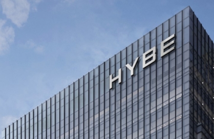
Hybe's multilabel system tested amid conflict with Ador
-
5
Rocket engine expert, ex-NASA exec to lead Korea's new space agency


![[Herald Interview] 'Amid aging population, Korea to invite more young professionals from overseas'](http://res.heraldm.com/phpwas/restmb_idxmake.php?idx=644&simg=/content/image/2024/04/24/20240424050844_0.jpg&u=20240424200058)


-
6
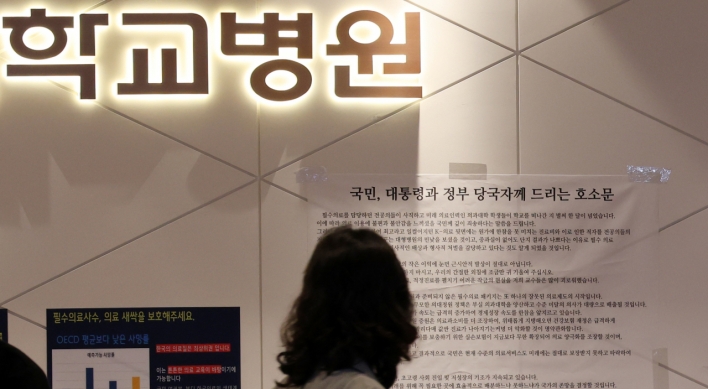
SNU profs to suspend treatment for one day

-
7
SK hynix pledges W20tr to ramp up DRAM production at home

-
8
Over-50s, men, single-person households take up majority of those filing for bankruptcy

-
9
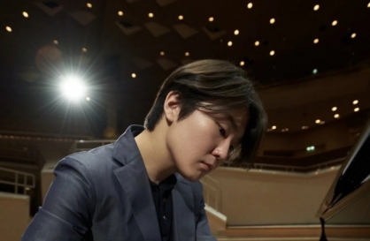
Pianist Cho Seong-Jin named Berlin Philharmonic's artist-in-residence
-
10
Ministry denies blame for Jamboree debacle


There are tens of thousands of them, in different colors and shapes.
At the base of the Seoul Tower on Mount Namsan, you can see how many different small padlocks there are in the world.
They are hanging on fences surrounding the tower and Christmas tree-shaped metal structures.
These “padlocks of love” are put there by couples and families wishing for eternal love and happiness, believing that the locks symbolize vows and commitments.
Messages of affection and well-wishes are written on the sides of the locks. The aggregate weight of the metal locks is so overwhelming that the management office has to take them down every three months to prevent the meshed walls from collapsing.
When I hear explanations from the Seoul city government about the meaning of its new brand (the now famous I.Seoul.U), this tourist attraction spot at Seoul Tower came to my mind.
As the meaning of the new brand is explained to be “Seoul between you and me” or “Seoul connecting you and me,” to me the representative image of Seoul connecting two people is this scene at Seoul Tower.
The new Seoul branding has been creating a flow of parodies and criticism. The problem is that no one exactly understands what it means. Once an explanation is given, it may get sympathetic nodding.
Critics say that needing extra explanation itself makes the new logo a failure as a brand. Well, that may be true. But let’s give the new brand the benefit of the doubt. After all, previous brand attempts were awkward anyway: Think about “Soul of Asia” or “Hi Seoul.” Neither has any special flavor of Seoul. Nor is there any evidence that they struck a chord in the minds of foreign visitors. Now, at least the new brand is explained to mean “Seoul between you and me.” A nice, affectionate catch phrase, certainly.
Innovative it may seem, but the new branding does not so much “represent” the city as “describe” a specific function the city carries out for the people there, even if the function is a good one such as connection. By putting Seoul between “I” and “U,” it can be read and understood, naturally, to be meaning Seoul does something for us. That is, “I.Seoul.U” or “U.Seoul.Me” would mean that Seoul does something for you or me: It is not representative of the city, nor reflective of how people feel about the city (like “I Love NY”). Again, the city government explains that the function presumed here is the connection between people.
If the intended message is “my Seoul, your Seoul and our Seoul” or something along those lines, then there should be a more proper phrase for that. “I.Seoul.U” hardly conveys such a message. Even if the explanations from the city government are taken at face value, the branding seems to work best for international travel agencies. It may also be a good slogan to use on the badges worn by information center workers in downtown Seoul. It means someone or some entity that is connecting me and the city. But it is awkward for a logo that is supposed to represent a metropolitan city, particularly so given the special meaning explained by its proponents.
The message of the new logo is more awkward, if its purpose is to reflect the flavor of a global village: It sounds Seoul-specific rather than inclusive or inviting of global characteristics or visitors. It is innovative, but perhaps it has gone too far.
By Lee Jae-min
Lee Jae-min is an associate professor of law at Seoul National University. — Ed.

![[KH Explains] Korean shipbuilding stocks rally: Real growth or bubble?](http://res.heraldm.com/phpwas/restmb_idxmake.php?idx=652&simg=/content/image/2024/04/25/20240425050656_0.jpg&u=)