
Most Popular
-
1
Korea’s homegrown nanosatellite successfully launches into space

-
2
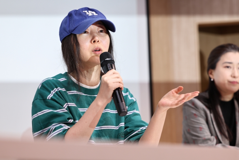
Ador CEO denies allegations, accuses Hybe of mistreating NewJeans
-
3
[Herald Interview] 'Amid aging population, Korea to invite more young professionals from overseas'
![[Herald Interview] 'Amid aging population, Korea to invite more young professionals from overseas'](//res.heraldm.com/phpwas/restmb_idxmake.php?idx=644&simg=/content/image/2024/04/24/20240424050844_0.jpg&u=20240424200058)
-
4
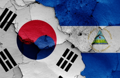
Nicaragua shuts down Seoul embassy
-
5
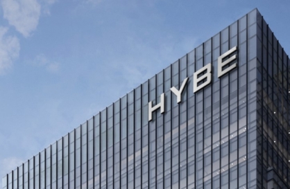
Hybe's multilabel system tested amid conflict with Ador


![[Herald Interview] 'Amid aging population, Korea to invite more young professionals from overseas'](http://res.heraldm.com/phpwas/restmb_idxmake.php?idx=644&simg=/content/image/2024/04/24/20240424050844_0.jpg&u=20240424200058)


-
6
Rocket engine expert, ex-NASA exec to lead Korea's new space agency
-
7
SNU profs to suspend treatment for one day
-
8
SK hynix pledges W20tr to ramp up DRAM production at home
-
9
Over-50s, men, single-person households take up majority of those filing for bankruptcy

-
10
Medical reform committee kicks off despite boycott from doctors


It was a privilege a couple of weeks ago to play a small part in helping to choose a new brand for this dynamic city, so wanted to give my thoughts on what is a really brave approach to branding:‘I.Seoul.U’, the world’s first (mostly) crowd-sourced city brand.
It’s fair to say, that on first sight ‘I.Seoul.U’ is linguistically curious and grammaticallymaverick but once I saw it with the accompanying line ‘A city of me and you’, then it was pretty clear that it was saying ‘Me, Seoul and you’ together.
By distilling the enormity of Seoul down to a personal relationship between two people is a simple strategy that echoes my experience of the friendliness of Seoul.
One of the other three options ‘Seoulmate’ was based on the same thinking and would have made a good solid branding. Personally though, after having spent most of my advertising career trying to avoid puns, it was a little too familiar and had connotations with dating websites.
‘Seouling’ ticked the boxes when it came to being different and active. But it made me feel that Seoul was a very busy place that, perhaps, didn’t have time to stop to get to know me.
So of three choices given to me, I chose ‘I.Seoul.U’, which also turned out be the unanimous choice of the eight other people on the panel.
Beyond its strategic friendly intent -- I felt that it was a fresh, modern and flexible brand. Especially as you could put all the delights of Seoul in between the ‘I and you’ of the logo.

To me, Seoul (and Korea) represents a dynamic person that is not afraid to give things a go and the new positioning reflects that.
Since its adoption, I’ve noticed it has received plenty of attention, both positive and negative, which is to be expected with a new city brand.
Words, symbols and pictures take on new meanings as you live with them and they develop their own personality. So, I’d like to think that this great experiment is rewarded by the world looking at Seoul as a friendly, vibrant and free-thinking city that is prepared to step away from the familiar city brands we see around the world -- to deliver new ideas.
For what it’s worth, in the U.K., the London 2012 Olympic logo more than polarized opinion when it was launched, with many people disliking the almost childlike design and typography.
But as everyone in London lived with it for a while and the logo was exploded into the graphic design across the marketing materials and the venues themselves - it really did look and feel fantastic, and most visitors from around the world were not even aware that it had been a controversial choice.
So, let’s all see in a few months time how it feels. After all, the two young designers who came up with the idea and the team who helped them bring it to life, deserve for their creation to be given some breathing space to grow in our hearts and minds.
By Luke Ashton
The writer is the global creative director of Cheil Worldwide and one of the nine people on the Seoul city branding panel. The view expressed in this contributed article does not reflect that of The Korea Herald.
![[KH Explains] Korean shipbuilding stocks rally: Real growth or bubble?](http://res.heraldm.com/phpwas/restmb_idxmake.php?idx=652&simg=/content/image/2024/04/25/20240425050656_0.jpg&u=)