
Most Popular
-
1
[AtoZ into Korean mind] Humor in Korea: Navigating the line between what's funny and not
![[AtoZ into Korean mind] Humor in Korea: Navigating the line between what's funny and not](//res.heraldm.com/phpwas/restmb_idxmake.php?idx=644&simg=/content/image/2024/04/22/20240422050642_0.jpg&u=)
-
2
[Exclusive] Korean military set to ban iPhones over 'security' concerns
![[Exclusive] Korean military set to ban iPhones over 'security' concerns](//res.heraldm.com/phpwas/restmb_idxmake.php?idx=644&simg=/content/image/2024/04/23/20240423050599_0.jpg&u=20240423183955)
-
3
Yoon seeks rebound, taps 5-term lawmaker as chief of staff

-
4
Medical standoff deepens as doctors reject new med school plan, talks
-
5
[Graphic News] 77% of young Koreans still financially dependent
![[Graphic News] 77% of young Koreans still financially dependent](//res.heraldm.com/phpwas/restmb_idxmake.php?idx=644&simg=/content/image/2024/04/22/20240422050762_0.gif&u=)
![[AtoZ into Korean mind] Humor in Korea: Navigating the line between what's funny and not](http://res.heraldm.com/phpwas/restmb_idxmake.php?idx=644&simg=/content/image/2024/04/22/20240422050642_0.jpg&u=)
![[Exclusive] Korean military set to ban iPhones over 'security' concerns](http://res.heraldm.com/phpwas/restmb_idxmake.php?idx=644&simg=/content/image/2024/04/23/20240423050599_0.jpg&u=20240423183955)


![[Graphic News] 77% of young Koreans still financially dependent](http://res.heraldm.com/phpwas/restmb_idxmake.php?idx=644&simg=/content/image/2024/04/22/20240422050762_0.gif&u=)
-
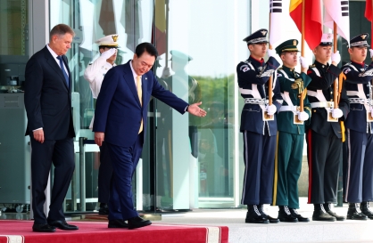
6
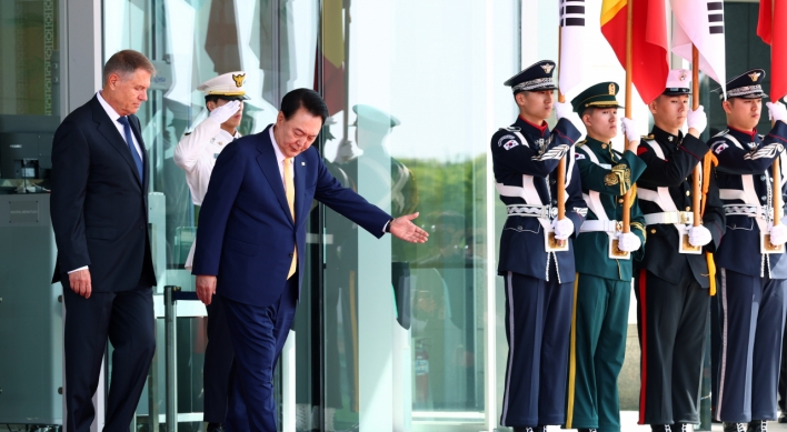
Korean, Romanian leaders discuss defense tech, nuclear energy
-
7
[Herald Interview] Why Toss invited hackers to penetrate its system
![[Herald Interview] Why Toss invited hackers to penetrate its system](//res.heraldm.com/phpwas/restmb_idxmake.php?idx=644&simg=/content/image/2024/04/22/20240422050569_0.jpg&u=20240422150649)
-
8
S. Korean envoys convene to navigate strategy amid Middle East tensions
-
9
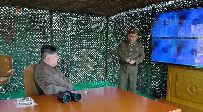
North Korea fires several short-range ballistic missiles into sea: JCS

-
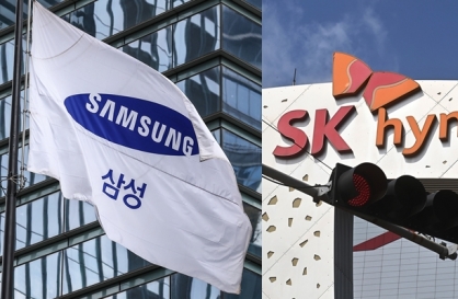
10
Samsung, SK hynix investors dump shares on Nvidia crash

![[Herald Interview] Why Toss invited hackers to penetrate its system](http://res.heraldm.com/phpwas/restmb_idxmake.php?idx=644&simg=/content/image/2024/04/22/20240422050569_0.jpg&u=20240422150649)


Stroke by stroke, Hangeul grows popular in design
Calligrapher Kang Byung-in uses brush and ink to explore beauty of Korean letters
By Korea HeraldPublished : Aug. 1, 2014 - 21:17
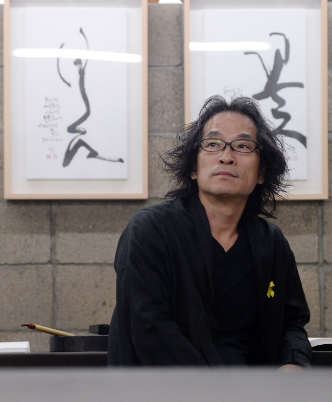
With his untamed shoulder-length hair, dark-rimmed glasses and loose-fitting black outfit, calligrapher Kang Byung-in has the quintessential look of an artist. The name of his company, Sooltong, might suggest that he likes his drinks: Sooltong can be translated as “barrel of alcohol.”
Indeed, he does like drinking, Kang admits during an interview with The Korea Herald last month at his cramped studio in the artists’ enclave of Hongdae area. As Kang explains it, Sooltong is a double entendre in Korean ― it means “barrel of alcohol” and it can also be a shortened form of “easy communication.” “The name Sooltong also stands for a world where things are communicated well,” Kang says, adding, “Alcohol can be a good medium for communication.”
Perhaps it is no coincidence, then, that Kang made a name for himself with the Hangeul calligraphy he did for a soju line, Chamisul, in 2006. In fact, his works can be found on numerous bottles from Korean breweries, including Baesangmyun Brewery, a brewery recognized for its efforts to revive traditional Korean alcoholic beverages, as well as Hwayo, a premium soju brand by Kwangjuyo.
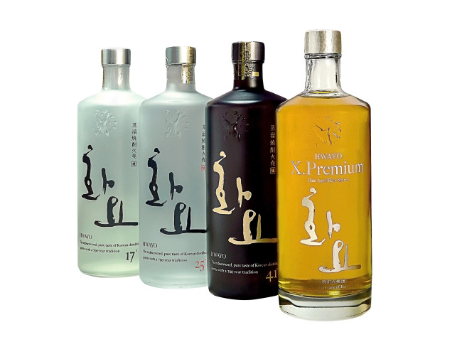
Hwayo broke new ground in the soju market by elevating the status of what is usually considered a poor man’s drink. “It is a premium drink and the calligraphy had to have class,” Kang says. Kang wrote Hwayo in Hangeul using bold brushstrokes. “The two letters form an image of sages playing a game of baduk and drinking soju under a plum tree,” Kang says. Noting the growing popularity of Hwayo, Kang says it is fulfilling to see the products he worked on do well.
Sometimes, Kang is so impressed with a product that he will consider working on it even without being offered the project. That is what happened with Ipsaeju, a local soju from South Jeolla Province. “I was traveling through the region, liked the drink and seriously contemplated doing the calligraphy for the bottle,” he says. Sometime later, an acquaintance called about doing calligraphy for a soju company. “It turned out that it was the same soju that I’d had in Gwangju!” Kang says.
Does he mix drink with work, as some artists are wont to do? “I will taste the drink before I start ― I am sent samples of the new products. But I don’t drink while doing commercial projects because I need to be rational and have full understanding of the product,” Kang says.
He notes with weariness that while Hangeul calligraphy has made strides in the last 10 years as a design genre, despite initial disdain from more traditionalist calligraphers, it is now overused to a point where there is no reason to use Hangeul calligraphy on certain products.
Walking down a pastes and sauces aisle at any supermarket, one will see most products featuring Korean calligraphy on their packaging. While Kang was one of the first to use Korean calligraphy on packaging for food behemoth CJ Cheil Jedang’s traditional Korean pastes and sauces, he notes it is now overdone.
“In designing packages, the most important thing is to differentiate the product from all the others. These days, it is difficult to distinguish one product from another,” Kang says, because they all bear Hangeul calligraphy. Now there is a move toward using types and computer-generated letterings, he notes.
Kang faults calligraphers for the flood of similar-looking products, arguing that calligraphers need to study more and be aware of the trends of the times.
Package designers are not free from blame either. “Designers should exercise more prudence when choosing calligraphy. It takes years to develop a product; companies should pay attention to design,” Kang says.
A notable feature of Kang’s calligraphy is the pictogram-like quality of the Korean words in his noncommercial artworks. Take, for example, the Korean word for flower, “kkot,” a recurrent word in Kang’s art. Written in Hangeul, just the look of the word evokes a flower. It is easy to see a mountain peak in “san,” the Korean word for mountain.
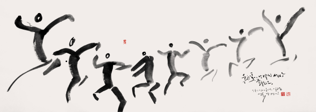
Working with purely Korean words is easier than using Korean words of Chinese origin, Kang observes. “There is more ‘volume’ to purely Korean words. They are more emotional, prettier,” he says, adding he is happy and grateful for this.
Hangeul is Kang’s great inspiration and his works aim to naturally express the usage, form and sound of the Korean language. “Hangeul is a great example of harmony between man and nature,” he says.
For the next year or two, Kang plans to continue working on the symbolic imagery of Hangeul. “My ultimate goal, however, is to discover the various shapes of Hangeul,” he says.
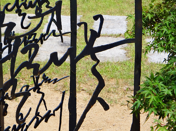
More immediately, Kang will hold an exhibition of his artworks in October, continuing his experiments with Hangeul: While his 2011 solo exhibition showed Hangeul calligraphy pieces in the traditional sense of the term, the following year’s show had Kang experimenting with different tools and materials, including twigs and silk printing. He has now moved on to creating 3-D, upright Hangeul calligraphy.
“There is no need to lock Hangeul into a mold. Exploring its various values will lead to commercializing Hangeul as a design source,” he says.
Next year, Kang plans on holding a contemporary Hangeul calligraphy class for CEOs in response to popular demand. While calligraphy has become popular ― calligraphy classes are even offered at cultural centers run by department stores ― more studies on theory and education must take place for the boom to be sustainable, Kang notes.
Kang has been harboring the idea of showing his Hangeul calligraphy overseas for quite some time but feels that the perception of calligraphy abroad has to change before this can happen. He relates the story of an exhibition held at a French diplomat’s residence in Seoul. The response from the foreign guests was very enthusiastic and a guest picked out a piece to buy, only to end up not purchasing it.
Kang was told that the guest thought the 3 million won ($2,900) price tag was too much for a work done in one sitting, unlike Western oil painting, for example, which can take days or months to complete. “That was a shock to me. I realized then that many Westerners do not know about the years of patient practice required to make it seem effortless,” Kang says.
After all, calligraphy is not random strokes. It requires so much patience and self-discipline that it is often seen as a form of meditation. Not to mention that arriving at an original style requires years of studying and practicing.
“This problem of perception needs to be resolved before calligraphy works can get the appreciation they deserve. I am thinking of ways to address this, but it is not easy,” says Kang.
By Kim Hoo-ran, Senior writer
(khooran@heraldcorp.com)
-
Articles by Korea Herald

![[Exclusive] Korean military to ban iPhones over security issues](http://res.heraldm.com/phpwas/restmb_idxmake.php?idx=652&simg=/content/image/2024/04/23/20240423050599_0.jpg&u=20240423183955)
![[Today’s K-pop] Ateez confirms US tour details](http://res.heraldm.com/phpwas/restmb_idxmake.php?idx=642&simg=/content/image/2024/04/23/20240423050700_0.jpg&u=)