
Most Popular
-
1
1 in 3 Koreans live alone, family types becoming diverse

-
2
Korea, Japan finance chiefs vow to tame rampant FX market volatility

-
3
US 'incredibly concerned' about suspected NK-Iran military ties

-
4
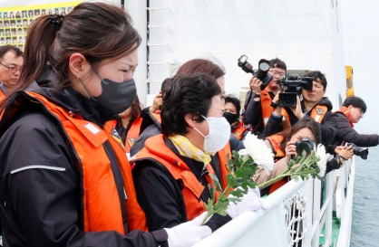
Sewol victims commemorated on tragedy's 10th anniversary
-
5
K-pop group's manager dismissed for setting up spycam in theater dressing room


-
6
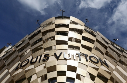
Chanel, Louis Vuitton see muted growth in Korea
-
7
K-pop singer lost consciousness after being hit by foul ball, cancels show

-
8
Korean Muslim YouTuber's plan to build mosque in Incheon goes viral

-
9
[Kim Seong-kon] Democracy and the future of South Korea
![[Kim Seong-kon] Democracy and the future of South Korea](//res.heraldm.com/phpwas/restmb_idxmake.php?idx=644&simg=/content/image/2024/04/16/20240416050802_0.jpg&u=)
-
10
Yoon's office denies considering liberal figures for key posts


![[Kim Seong-kon] Democracy and the future of South Korea](http://res.heraldm.com/phpwas/restmb_idxmake.php?idx=644&simg=/content/image/2024/04/16/20240416050802_0.jpg&u=)


NEW YORK (AP) ― Orchid is growing on us: A version of the purple hue is Pantone Inc.’s color of the year for 2014.
It follows this year’s pick of emerald green.
Officially known as Radiant Orchid, the tropical shade is a color-wheel contrast to green, said Leatrice Eiseman, executive director of the Pantone Color Institute, but it’s not the red that would have been a more obvious choice. “It’s a little different, it’s a little off the beaten path, and it’s not a primary color,’’ she explains. “It’s an invitation to innovation. The purple family offers (an) opportunity to do creative things.’’
And, she said, that’s what pop culture wants right now. “People associate purple with creativity and originality ― and those are very valued today. We see words like that being used to describe technologies and products that are seen as innovative and with an approach you haven’t tried before.’’
Pantone sets color standards for commercial use by design industries.
Eiseman expects people will take to it quickly because it’s a flattering color for many skin tones and complementary neutral colors, but it will also look like something people haven’t seen in a while. That should work in an economy that’s uncertain ― not totally up, not fully down. “This is an opportunity to look at what you’ve already got in your closet and add to it. It will feel like the right amount of change.’’
The runways and red carpet have already had a few orchid moments, and Eiseman notes it’s a color that first lady Michelle Obama often wears. Even menswear has seen hints of it, with Salvatore Ferragamo and Ermengildo Zegna incorporating it into ties and trims.
Pantone’s pick for color of the year will, in theory, have a strong presence in fashion, beauty, home design and consumer products.
“It’s very relevant for spring, but I think even going into next fall it can be very pretty,’’ said Colleen Sherin, senior fashion director of upscale department store Saks Fifth Avenue. “In ready-to-wear, it mixes with other tones like chocolate browns, and burgundy or Bordeaux makes for a deeper, richer tonal story.’’
Sherin has invested the retailer’s resources in orchid, and an orchid-colored Gucci handbag has already been photographed for a Saks ad. It will translate just as well into lip color and eye shadow, and in home furnishings, she said. “I would love it in velvet. It would look so luxurious.’’
It’s a paint color and could be used in upholstery, and she can imagine it on the table, too. “We’re seeing more of these infused desserts and cocktails, and I can see them embellished with orchid flowers.’’
Eiseman said the sign of success in her world is when she sees a color on a coffee maker, and one in orchid is already in the works.
-
Articles by Korea Herald


![[KH Explains] Hyundai's full hybrid edge to pay off in slow EV transition](http://res.heraldm.com/phpwas/restmb_idxmake.php?idx=652&simg=/content/image/2024/04/18/20240418050645_0.jpg&u=20240418155304)
![[Today’s K-pop] Zico drops snippet of collaboration with Jennie](http://res.heraldm.com/phpwas/restmb_idxmake.php?idx=642&simg=/content/image/2024/04/18/20240418050702_0.jpg&u=)