
Most Popular
-
1
[AtoZ into Korean mind] Humor in Korea: Navigating the line between what's funny and not
![[AtoZ into Korean mind] Humor in Korea: Navigating the line between what's funny and not](//res.heraldm.com/phpwas/restmb_idxmake.php?idx=644&simg=/content/image/2024/04/22/20240422050642_0.jpg&u=)
-
2
Yoon seeks rebound, taps 5-term lawmaker as chief of staff

-
3
Medical standoff deepens as doctors reject new med school plan, talks

-
4
[Exclusive] Korean military set to ban iPhones over 'security' concerns
![[Exclusive] Korean military set to ban iPhones over 'security' concerns](//res.heraldm.com/phpwas/restmb_idxmake.php?idx=644&simg=/content/image/2024/04/23/20240423050599_0.jpg&u=20240423183955)
-
5
[Herald Interview] Why Toss invited hackers to penetrate its system
![[Herald Interview] Why Toss invited hackers to penetrate its system](//res.heraldm.com/phpwas/restmb_idxmake.php?idx=644&simg=/content/image/2024/04/22/20240422050569_0.jpg&u=20240422150649)
![[AtoZ into Korean mind] Humor in Korea: Navigating the line between what's funny and not](http://res.heraldm.com/phpwas/restmb_idxmake.php?idx=644&simg=/content/image/2024/04/22/20240422050642_0.jpg&u=)


![[Exclusive] Korean military set to ban iPhones over 'security' concerns](http://res.heraldm.com/phpwas/restmb_idxmake.php?idx=644&simg=/content/image/2024/04/23/20240423050599_0.jpg&u=20240423183955)
![[Herald Interview] Why Toss invited hackers to penetrate its system](http://res.heraldm.com/phpwas/restmb_idxmake.php?idx=644&simg=/content/image/2024/04/22/20240422050569_0.jpg&u=20240422150649)
-
6
[Graphic News] 77% of young Koreans still financially dependent
![[Graphic News] 77% of young Koreans still financially dependent](//res.heraldm.com/phpwas/restmb_idxmake.php?idx=644&simg=/content/image/2024/04/22/20240422050762_0.gif&u=)
-
7
S. Korean envoys convene to navigate strategy amid Middle East tensions

-
8
Korean, Romanian leaders discuss defense tech, nuclear energy

-
9
North Korea fires several short-range ballistic missiles into sea: JCS

-
10
Samsung, SK hynix investors dump shares on Nvidia crash

![[Graphic News] 77% of young Koreans still financially dependent](http://res.heraldm.com/phpwas/restmb_idxmake.php?idx=644&simg=/content/image/2024/04/22/20240422050762_0.gif&u=)


Reading books by their cover
Exhibition features Penguin book design and its connection to history
By 박한나Published : Dec. 28, 2012 - 14:14
Don’t judge a book by its cover, so goes an old saying, but looking at this book exhibition one is reminded of what Oscar Wilde once said: “It is only shallow people who do not judge by appearances; the true mystery of the world is the visible, not the invisible.”
Kyobo Book Center’s current exhibition, “Art, Design, Culture: The History of Penguin by Design,” shows how book covers have responded to ― and influenced ― changing trends and culture in the past 77 years. The exhibition, featuring design works by Penguin Books since 1935, was first shown at the Victoria and Albert Museum in London, and is now in Seoul after being shown in Beijing and Hangzhou, China.
“For a book to stay in print for decades it has to successfully compete with newly released titles,” says the exhibition.
“An effective way to ensure this is to apply a new cover design when it is reprinted in new editions.”
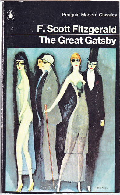
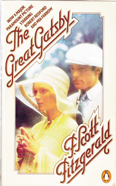
It is fascinating to see a total of 10 different covers of F. Scott Fitzgerald’s “Great Gatsby” all at once. Penguin Books has been publishing the novel since 1950, and its very first cover is rather simple. It has Penguin’s signature horizontal grid ― divided into three equal parts ― and the Penguin logo at the bottom. In the 1970s, publishers introduced romantic paintings of Gatsby and Daisy for the novel’s cover, showing the interesting changes in both printing methods and public taste.
Kyobo Book Center’s current exhibition, “Art, Design, Culture: The History of Penguin by Design,” shows how book covers have responded to ― and influenced ― changing trends and culture in the past 77 years. The exhibition, featuring design works by Penguin Books since 1935, was first shown at the Victoria and Albert Museum in London, and is now in Seoul after being shown in Beijing and Hangzhou, China.
“For a book to stay in print for decades it has to successfully compete with newly released titles,” says the exhibition.
“An effective way to ensure this is to apply a new cover design when it is reprinted in new editions.”
It is fascinating to see a total of 10 different covers of F. Scott Fitzgerald’s “Great Gatsby” all at once. Penguin Books has been publishing the novel since 1950, and its very first cover is rather simple. It has Penguin’s signature horizontal grid ― divided into three equal parts ― and the Penguin logo at the bottom. In the 1970s, publishers introduced romantic paintings of Gatsby and Daisy for the novel’s cover, showing the interesting changes in both printing methods and public taste.

Viewers will also get to learn about Penguin’s logo and how it was created. According to the exhibition, Penguin’s founder Allen Lane wanted to find “an elegant yet whimsical name” for his publishing house.
At the time, good-quality books were not easily accessible, while cheap paperbacks, though more widely available, were of low quality. Lane’s aim was to introduce high-quality paperback books for the reading public.
It was his secretary who suggested the name “Penguin” during a meeting, which Lane eventually selected. The logo, which takes a form of a Penguin, was created in 1935 by an employee named Edward Young.
“He based his design on the movement made by a penguin in a zoo,” the exhibition explains.
It is also interesting to learn about Penguin’s designers.
Among them, Alan Aldridge, served as Penguin’s art director in 1965, firmly believed that the cover of a book should catch readers’ attention right away. His cartoony, unconventional designs well reflect the trend and counterculture movement in the U.K. in the 1960s; the covers stressed individual titles rather than the publishers’ name. Aldridge left Penguin Books in 1968 and later was involved with creating graphic images for The Beatles and Apple Corps., a multimedia corporation founded by The Beatles.
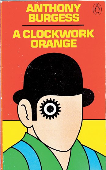
It was David Pelham who filled Aldridge’s spot in 1968. One of Pelham’s iconic works is the cover of English writer Anthony Burgess’ novel “A Clockwork Orange.” He created a jacket for the novel’s 1972 edition, an outstanding example of the simplified, modern grid he introduced at the time. He also let individual designers decide and create all the elements for the covers, except the Penguin logo and the name of the series.
The exhibition also features various original and rare book jackets and artwork by the world’s top graphic, fashion and design talents, including David Pearson, Coralie Bickford-Smith and Jillian Tamaki.
“Art, Design, Culture: The History of Penguin by Design” runs until Jan. 20 at Kyobo Book Center’s Gwanghwamun branch. Admission is free. For more information, call (02) 2014-8843.
By Claire Lee (dyc@heraldcorp.com)

![[Exclusive] Korean military to ban iPhones over security issues](http://res.heraldm.com/phpwas/restmb_idxmake.php?idx=652&simg=/content/image/2024/04/23/20240423050599_0.jpg&u=20240423183955)


![[Today’s K-pop] Ateez confirms US tour details](http://res.heraldm.com/phpwas/restmb_idxmake.php?idx=642&simg=/content/image/2024/04/23/20240423050700_0.jpg&u=)